Introduction
Accessibility, often abbreviated as a11y, is a crucial aspect of mobile app development, emphasizing the inclusivity and usability of applications for everyone, including individuals with disabilities.
The importance of accessibility is highlighted by a staggering statistic: approximately 1.3 billion people, or 16% of the world's population, experience significant disability, as reported by the World Health Organization. This represents a substantial segment of potential app users. Neglecting accessibility in app design not only excludes a significant portion of the population but also leads to potential business losses.
This article explores the key aspects of accessibility in mobile apps, covering its business impact, Flutter's supportive features, best practices, and real-world examples to enhance user engagement and inclusivity.
Accessibility Key Concepts
Accessibility in mobile apps is grounded in the POUR principles, each addressing a critical aspect of user experience:
- Perceivable: This principle ensures that all users can perceive the information presented in the app. This involves providing text alternatives for non-text content, making it easier for users to see and hear content.
- Operable: User interface components and navigation must be operable for all users. This includes making all functionality available from a keyboard, giving users enough time to read and use content.
- Understandable: Information and the operation of the user interface must be understandable. This means making text readable and understandable, making content appear and operate in predictable ways, and helping users avoid and correct mistakes.
- Robust: Content must be robust enough to support and be accessed on variety of devices, including assistive technologies. This means that as technology and user agents evolve, the content must still remain accessible, and be able to be interpreted.
Accessible design principles, detailed in Material Design’s guidelines, focus on a proactive design strategy.
- "Honor Individuals" emphasizes respecting and understanding diverse user needs.
- "Learn Before, Not After" advocates for proactive research and design thinking to anticipate accessibility needs.
- "Requirements as a Starting Point" suggests using minimum accessibility standards as the foundation for design.
Together, these principles guide the creation of inclusive and user-friendly mobile applications.
Accessibility Standards
The Web Content Accessibility Guidelines (WCAG) are a central standard in mobile app accessibility. Developed by the World Wide Web Consortium (W3C), WCAG provides a comprehensive framework for designing and developing accessible content. Adhering to these guidelines ensures that apps are accessible to all users, including those with disabilities.
Here is a summary of the structure and key points of WCAG:
- Principles: WCAG is organized under four POUR principles described above.
- Guidelines: Each principle is further divided into guidelines that provide specific recommendations for achieving accessibility.
- Success Criteria: Each guideline has testable success criteria that determine the level of conformance to WCAG. The success criteria are categorized into three levels: A, AA, and AAA, with AAA being the highest level of accessibility. Level AA is the most commonly preferred option. When testing for compliance, it is necessary to also assess compliance with the criteria of the previous level.
In practical terms, applying WCAG to mobile apps involves incorporating accessibility features that adjust text size and screen contrast, using screen readers to improve interface accessibility, ensuring all textual content is readable and not embedded in images, and maintaining a color contrast ratio compliant with WCAG guidelines.
The guidelines are continually updated to accommodate new technologies and challenges in accessibility, making them a dynamic and essential resource for developers. Following WCAG is crucial for creating inclusive digital environments and for compliance with various legal requirements around the world.
Impact on Business
Embracing accessibility in mobile app development has a significant impact on business:
- Brand reputation: Prioritizing accessibility in app development demonstrates a company’s dedication to inclusivity, significantly improving its public image.
- Innovation: By meeting accessibility standards, developers are encouraged to explore creative and versatile approaches to app design, fostering innovation.
- Market reach: Accessible apps have the potential to reach a broader audience, including the significant population of individuals with disabilities.
- Increase in income: By catering to a wider range of users, companies can tap into new market segments, potentially boosting their revenue.
- Customer loyalty: Demonstrating a commitment to accessibility reflects a company’s social responsibility, which can strengthen customer trust and loyalty.
Accessibility Best Practices
Here are several best practices, grounded in guidelines from Material 3 to help you enhance the inclusivity of your mobile applications.
Sufficient contrast: Ensure text and interactive elements stand out against their background to aid users with visual impairments. Material 3 recommends a contrast ratio of at least 4.5:1 for text to background.
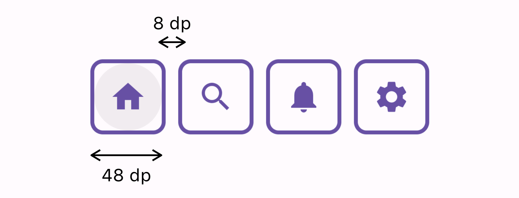
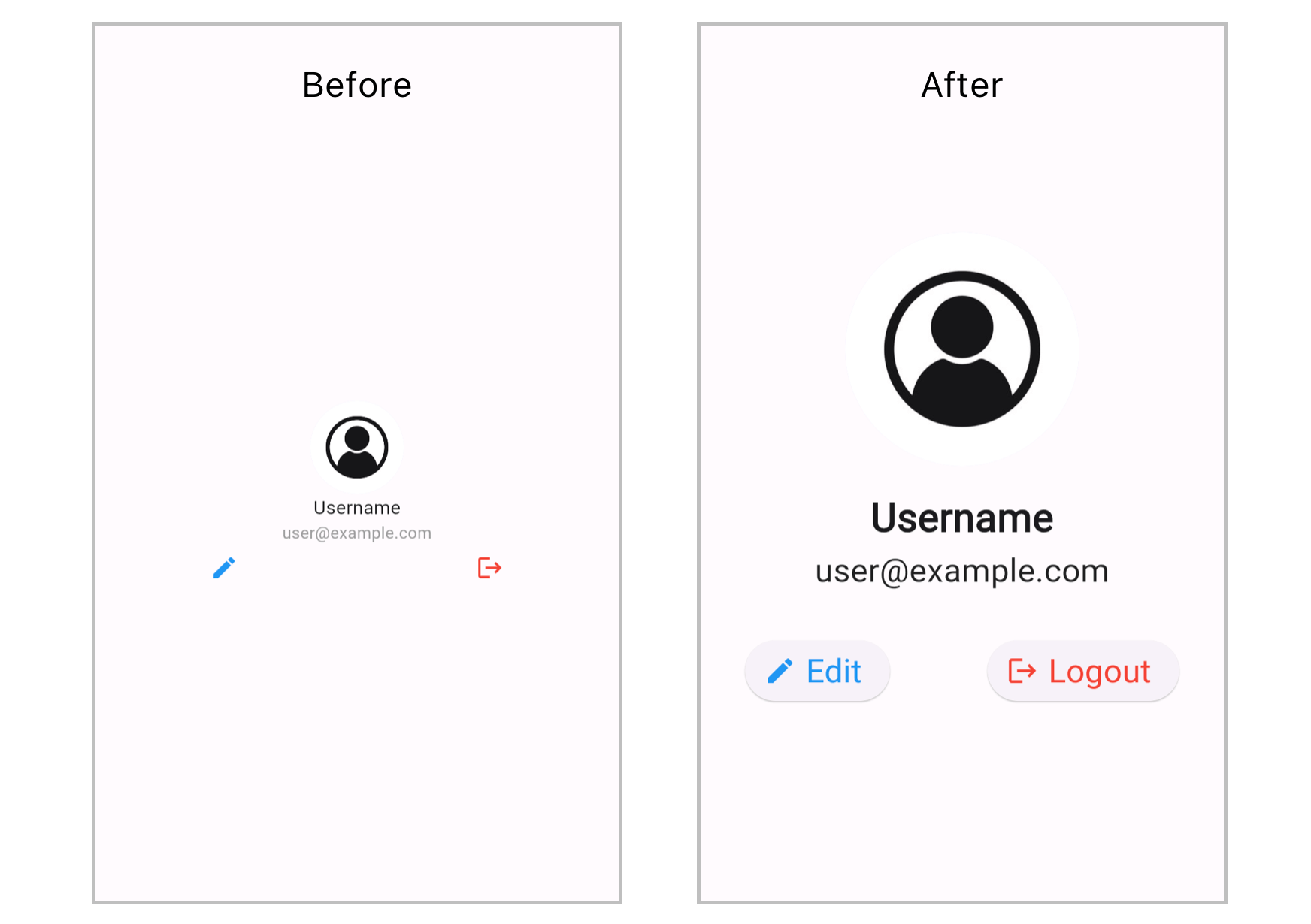
Minimum button size: Interactive elements should be easy to tap. A minimum size of 48x48 dp is recommended to accommodate users with motor impairments.
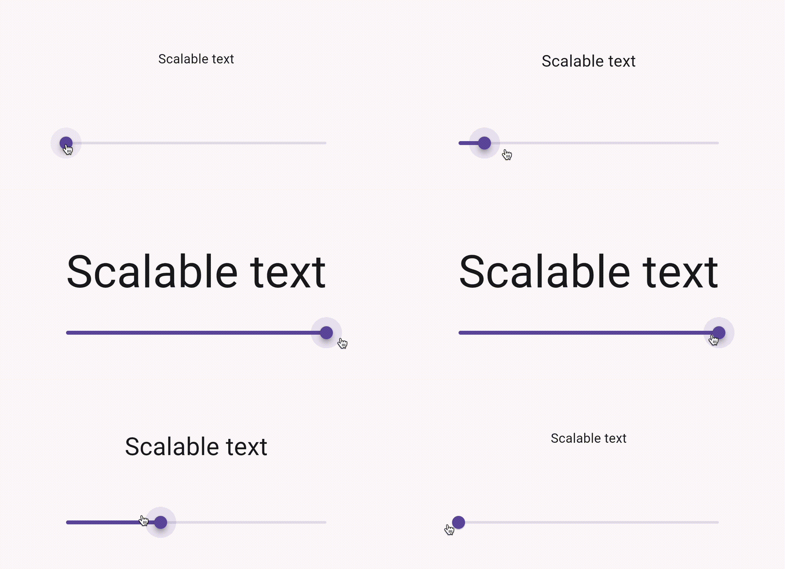
Text scaling: Support dynamic text sizing to help users with low vision. Flutter apps should respond well to text size adjustments made in the device settings.
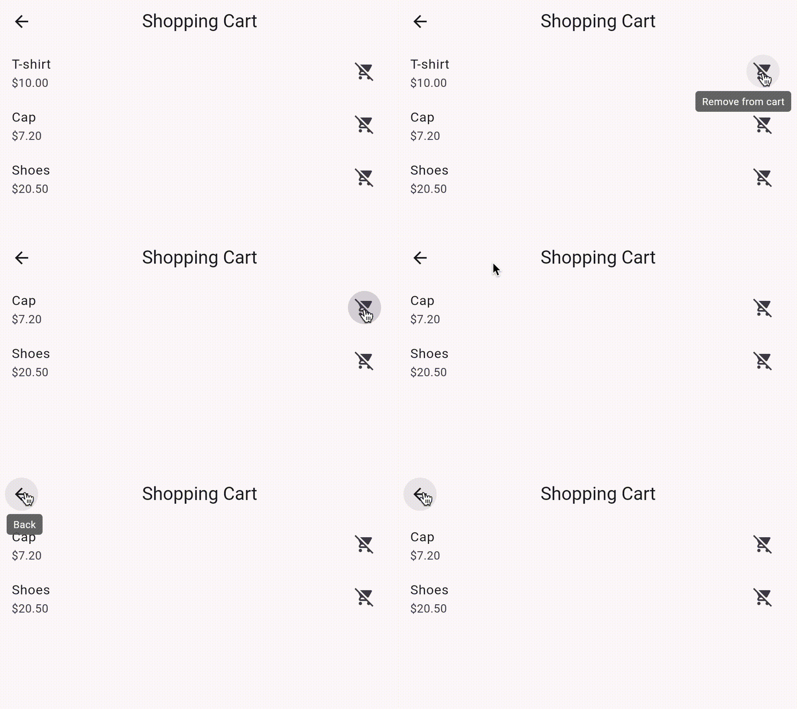
Semantic labeling: Use the Semantics widget to provide descriptive labels for UI components, enhancing screen reader navigation.
Clear and simple navigation: Design your app's navigation to be intuitive and easy to understand, minimizing cognitive load, especially for users with cognitive disabilities.
Visible focus indicators: Ensure that focus indicators are clearly visible for users navigating with keyboards or assistive technologies.
Provide alternatives for auditory content: Offer captions or transcripts for audio content, ensuring users who are deaf or hard of hearing can access the information.
Use descriptive icons and buttons: Accompany icons with text labels to clarify their purpose, making interfaces more intuitive.
Test with accessibility tools: Utilize tools like the Accessibility Scanner for Android and the Accessibility Inspector for iOS to identify and address potential accessibility issues in your app.
Adopt high-contrast themes: For users who need higher contrast, implementing a high-contrast theme option can make your app more accessible.
Accessible Mobile App Examples
From reading and note-taking to staying connected and managing our homes, apps like Amazon Kindle, Evernote, Facebook, Spotify, Fitbit, iDevices Connected, and others are leading the charge in accessibility.
Amazon Kindle and Evernote cater to the avid reader and the meticulous planner, respectively, with features like adjustable text sizes and voice commands, making content accessible to users with visual or motor impairments.
Social networking giant Facebook and music streaming service Spotify have also embraced accessibility, with alternative text for images and screen reader support ensuring everyone can enjoy what they have to offer.
Fitbit's health tracking capabilities are made accessible with large buttons and easy navigation. The smart home industry is not left behind, iDevices Connected simplifies managing home's lights, thermostats, and more through voice activation or a mobile device, aiding individuals with motor impairments.
More examples of accessible mobile applications are described on the AFB website.
A11y Testing Tools
There are a variety of tools and practices designed to enhance usability for individuals with disabilities. Key mobile app tools are VoiceOver and TalkBack.
VoiceOver (iOS): Enables iPhone users to navigate and interact with their device through gestures, even without visual feedback.
VoiceOver Guide
TalkBack (Android): Provides spoken feedback and vibrations on Android devices, assisting users with visual impairments.
TalkBack Guide
Developers have access to a range of tools for a11y testing that help them create accessible apps with a seamless user experience for individuals with diverse needs.
Accessibility inspector (Xcode): Integrated tool in Xcode for identifying and addressing accessibility issues in iOS apps.
Android accessibility scanner: Scans Android apps for accessibility problems and offers suggestions for improvement.
Color contrast analyzers: Tools like ColorSlurp and Contrast — Color Accessibility ensure sufficient contrast in app elements for users with visual impairments.
Flutter Accessibility
Flutter, one of the most popular mobile frameworks developed by Google, enables the creation of visually appealing, natively compiled applications for mobile, web, and desktop platforms using a single codebase. Powered by the Dart language, Flutter offers a wide range of pre-made widgets that facilitate efficient and expressive UI development.

Flutter's approach to accessibility is deeply integrated into its widget framework, offering a variety of widgets designed to make mobile applications more accessible. This seamless integration allows developers to build apps that are inherently more usable for everyone. Here's a breakdown of key accessible widgets in Flutter.
Semantics
The Semantics widget is central to Flutter's accessibility model, providing a way to annotate the UI with information for accessibility tools like screen readers. It allows developers to label UI components for voice-over, adjust text-to-speech settings, and define the semantics of custom widgets that might not be inherently accessible.
Semantics(
  label: 'Password Text Field',
  hint: 'Enter your password',
  child: TextFormField(
    obscureText: true,
    decoration: InputDecoration(
      labelText: 'Password',
    ),
  ),
)
MergeSemantics
When you have multiple widgets that should be presented as a single item to accessibility tools, MergeSemantics combines their semantic information into one node. This is useful for complex widgets made up of several smaller widgets but should be recognized as one entity by screen readers.
It contrasts with the Semantics widget by not adding semantic information but rather merging existing semantic information of its children into a single node.
MergeSemantics(
  child: Row(
    children: <Widget>[
      Checkbox(
        value: _isChecked,
        onChanged: (bool value) {
          setState(() {
            _isChecked = value;
          });
        },
      ),
      Text('Enable Notifications'),
    ],
  ),
)
ExcludeSemantics
This widget is used to remove all semantic information from a subtree. This can be useful when a portion of the UI is not relevant for accessibility purposes and could clutter the semantic tree.
ExcludeSemantics(
  child: Text('This text will be hidden from screen readers'),
)
Other features
While not a widget per se, Flutter's routing mechanism supports accessible navigation patterns. This means ensuring that when a new screen or modal is presented, accessibility tools are notified and can read out the new content appropriately.
Flutter also emphasizes the importance of larger tap targets through widgets like GestureDetector and InkWell, catering to users with motor impairments by making interactive elements more accessible.
Beyond widgets, Flutter's architecture inherently supports features like text scaling, ensuring text remains legible and accessible across different device sizes and user settings. This adaptability is vital for users with visual impairments who may require larger text to read comfortably.
Conclusion
The urgency of accessibility in mobile apps cannot be overlooked. By prioritizing accessibility, developers not only fulfill ethical and legal standards but also drive innovation in design and functionality, ensuring that their apps resonate with a wide audience and offer a seamless user experience.
At What the Flutter, we have been developing mobile applications using Flutter for more than five years, from the very beginning of its first release. Flutter, with its built-in widgets and features designed for inclusivity, emerges as an ideal platform for building accessible mobile applications. If you're looking to develop a mobile or web app or need assistance in making your app accessible for all, we're here to help. Contact us to kickstart your project. Together, we can turn your vision into a reality, creating apps that stand out and welcome everyone.


